Sunday 26 February 2012

I Need a new Easel..

After painting for the last couple of years on a small desktop easel I have decided to get myself a stand up one, I dont need anything top of the range just something plain and simple. Three have caught my eye and I'm not sure which one to buy, these are the ones Ive been looking at:

Loxely Sterling Studio Easel £85 inc Del


Loxley Essex Studio Easel at £87 inc Del


PROFI EASEL for £65 inc Del


Can anyone recommend any of these? I would be intersted if anyone has got the last one as its not a known name to me and it has mainly got good reviews but theres a couple of average ones too..

Finally Im in Sync with the Blog and the Projects.


I have just taken two days off college work to update the Blog to allow me to catch up with everything and now I'm finally finished. I will be starting a new project in the next two days getting some research done. I have two more projects left to do and that will be the end of the course which is C&G L3 Creative Techniques in 2D mixed media. This is the last year and there isn't a level 4 so I not sure what I’m doing next year either I will take a year off and learn by doing for a year rather than all this sampling I can get on with drawing and painting. Or the other option is to do a two year foundation degree in Art and Design but this means high course fees plus the course isn't just related to Fine Arts.

I have chosen two of the briefs I wish to do and I’m just waiting for an email to decide which one I will do first, the projects are:

Life Drawing - Figure, Colour
Drawing and Painting - Townscape with Buildings and Figures

The Project briefs can be seen above as pdf files, just click on the links or if you wish to view all the projects briefs that are available you can see them as a PDF
here

Project 6: Watercolour Final Design Evaluation

Project has to end somewhere, time has ran out.

Unfortunately for now this project will have to end due to I’m running out of time but I will properly come back to it and change the few bits I need to. The first thing would be the hairstyle, I would do some research into woman’s hairstyles and change it maybe even no hair at all which will give the design a different feeling. Also I would look at the harsh lines that the masking fluid has left behind, in general I think the project is going in the right direction even though it’s not a completed design yet in has a lot of potential. A full evaluation can be seen below.


Evaluation for Watercolours

Summary of Project:
I started of this section questioning if I was choosing the correct medium to sample. I had already chosen Oil Pastels to sample which went well and I also picked Acrylics which is the medium I favour. I decided to choose something that was out of my comfort zone I honestly detested watercolours before this project; I couldn’t even produce a flat wash without getting streaks or blemishes.

I started of the project by comparing the different brands of watercolour I tested the full intensity to the weakest mix I could produce. Next I experimented with forming tints by adding water; I compared that to adding Chinese white instead to the paint. Whilst experimenting with shades I recognized that to make certain colours darker it wasn’t as simple as just add a touch of black. Specific colours like yellow make black act as blue and turned yellow into a green instead of a darker shade of yellow. To overcome this you need to mix a darker hue from the same family for example add Burnt Umber to Lemon Yellow to create a darker shade.  

Once I understood how the colour theory worked with watercolours I moved onto mark making, I started off by looking at traditional methods and experimented with watercolour brushes. This headed to looking at other applications such as foam brushes, sponges, oil and also acrylic brushes. I tested layering one colour on top of another seeing which colours were more transparent and which ones were more opaque which also showed me how to produce a third colour. I rapidly moved on to techniques looking at wet on wet, wet on dry, dry on dry and dry on wet. I sampled and created washes until I mastered it. I had real difficulty at first but by sampling and changing different combinations I realised the paint I was using was causing the problems.  I also looked creating textures with watercolour this led to experimenting with loads of different materials which I wouldn’t general associate with painting. Tooth brushes, cardboard, bubble wrap, kitchen rolls, fingers, different types of salt and even Cling Film were some that I experimented with. The Cling Film was the one I choose for the final design as I really loved the result it left on the paint.

I previously used resist techniques when I sampling Oil Pastels but I needed to experiment this technique within watercolours. I also experiment with Beeswax, Oil Pastels, Candles, Crayons and China Markers. Other ways of keeping the paper white included masking fluid, scalpel knife, sandpaper, lifting off with brushes and kitchen roll. I bought some Artist colours as I only had student colours which I have always found adequate. I compared the same brand of Student colours against their artist colours and to be honest I wasn’t that impressed, I expected more of a wow factor. To me it didn’t justify the massive price difference between both products.

I decided on producing a figure drawing for my final design, which I grabbed from a Virtual Pose Dvd. I already sampled different ways of producing textures and out of the two I liked I used the Cling Film technique for the final piece. I decided to sample different colours for this technique and decided that a mixture of Cerulean and Ultramarine suited the design. Once that was decided I experiment with different mediums for creating the contour of the figure. I did initially use a white pastel but I was discovering that it was near impossible to see the line. Which resulted in the texture not completely being painted to the contour. I tried a Black China Marker, White Oil Pastel, Waterproof Marker, a Brush Pen, Crayon and then finally a waterproof fine liner which I favoured.


Final Design:
The final design is not complete there are still a few things I would like to attempt with the design however due to deadlines this project regrettably has to come to a close. I would like to have a look at the hair style on the figure maybe try a bald/short hairstyle, I could even use one of the textures I sampled and created really short hair. This would give the design a different feeling maybe sorrow, sadness or something else on the same lines. The masking fluid is creating such hard lines maybe I need to try applying the fluid with a softer brush or even add a bit of water I don’t really know how to resolve it without experimenting. I just want to produce a softer blend between the white of the paper and the paint rather than a harsh one which it is now. 

Once I’m delighted with the outcome I would like to try and reproduce the same image on a larger scale, it’s not just because a bought 50 sheets of large watercolour paper which I haven’t even used yet. I really feel the image would benefit on a larger scale, more detail could be added and it will achieve more of a wow factor as it will look more impressive larger than a smaller piece. Overall though I’m pleased with the final design, I know it isn’t finished and it is still work in progress but I reckon the image has loads of potential to being a portfolio piece but it just isn’t quite there at the moment.


Conclusion:
However after perseverance I feel I can control watercolour miles better than I could at the beginning, I even want to carry on with this project to complete the final design to a finish that I’m content with. This doesn’t mean watercolour will become my favourite far from it, there still things I feel are time consuming and still infuriate me. Stretching paper, taping it, waiting for it to dry it makes me want to scream and grab a canvas and some acrylic paint. Changing the water and cleaning the brushes out all the time just in case you discolour the yellow. Spending time mixing the paint trying to get the correct hue when you know it’s going to dry a lot lighter. Looking at the shine of the water on the paper in case it’s too wet or too dry to add some paint. Blooms, blemishes, water drops ruining the complete
image, never being able to get back the white of the paper due to the staining of the colours. Waiting for a layer of paint to dry completely before being able to add a layer on top, as you can see there’s still masses of things I don’t like about watercolours. The only thing I would like to do differently is try something more in a traditional style of a watercolour maybe a pen and wash landscape. I can’t begin to tell you how much I have learnt, the project this time was more about the journey then the final piece. I most definitely will use watercolour more often as I’m not apprehensive of using the medium any longer; I now feel content and I’m positive I picked the right medium to sample.

Project 6: Watercolour Final Design

Final Design Sample 06...

Paper: Gerstaecker No 3 @ 200gsm
Paint: Winsor & Newton Artists
Contour: Waterproof Fine Liner
Resist: Masking Fluid

I started by making a contour drawing with a 0.8 waterproof final liner, the highlights were created by using masking fluid. The background has been made with a mix of Cerulean and Ultramarine, the same mix has been used for the next few samples. If you split the page in half the left hand side of the background was laid with the wet on dry technique and the right had side was done using the wet on wet technique Cling Film was then placed on the background and left to dry before removing. Watercolour was then painting on top, I used 3 colours Lemon Yellow, Vermillion and Sap Green also an orange and a darker colour was mixed from the colours, this paint was applied with a Wet on Dry technique. This one seems to be getting there, a few things I’m still not happy with is the hair and also the harsh lines that are left over from the masking fluid.

Project 6: Watercolour Final Design

Final Design Sample 03....
Paper: Gerstaecker No 3 @ 200gsm
Paint: Crawford & Black Watercolour
Contour: Black China Marker (Chinagraph)
Resist: Berol White Oil Pastel 

I started by making a contour drawing with a black china marker, the highlights were made with a white oil pastel. The background has been made with a mix of Cerulean and Ultramarine, the same mix has been used for the next few samples. If you split the page in half the left hand side of the background was laid with the wet on dry technique and the right had side was done using the wet on wet technique Cling Film was then placed on the background and left to dry before removing. Watercolour was then painting on top, I used 3 colours Lemon Yellow, Vermillion and Sap Green also an orange and a darker colour was mixed from the colours, this paint was applied with a Wet on Dry technique. I’m not happy with the black china marker so I’m going to do a few more samples using different materials for the contour line. PLEASE CLICK THE IMAGES TWICE FOR THE LARGEST VIEW


Final Design Sample 04....
Paper: Gerstaecker No 3 @ 200gsm
Paint: Crawford & Black Watercolour
Contour: Waterproof Marker
Resist: Lifting Off

I started by making a contour drawing with a waterproof marker, the highlights were created by using the lifting off technique with a dry brush. The background has been made with a mix of Cerulean and Ultramarine, the same mix has been used for the next few samples. If you split the page in half the left hand side of the background was laid with the wet on dry technique and the right had side was done using the wet on wet technique Cling Film was then placed on the background and left to dry before removing. Watercolour was then painting on top, I used 3 colours Lemon Yellow, Vermillion and Sap Green also an orange and a darker colour was mixed from the colours, this paint was applied with a Wet on Dry technique. The marker reminded me of an illustration rather than Fine Art, could have done it with flat washes or simulated Benday dots with the Finger Cot which was sampled in Production Folder 4.


Final Design Sample 05....
Paper: Gerstaecker No 3 @ 200gsm
Paint: Crawford & Black Watercolour
Contour: Waterproof Black Brush Pen
Resist: White Crayon

I started by making a contour drawing with a Pentel Pocket Brush Pen, the highlights were created by using a white crayon. The background has been made with a mix of Cerulean and Ultramarine, the same mix has been used for the next few samples. The background was laid using the Wet on Dry technique Cling Film was then placed on the background and left to dry before removing. Watercolour was then painting on top, I used 3 colours Lemon Yellow, Vermillion and Sap Green also an orange and a darker colour was mixed from the colours, this paint was applied with a Wet on Wet technique. This is the first time I have used the brush pen and I found it quite difficult to use, I suppose it’s like anything the more you use it the more you get use to it. I love the idea of being able to create a thick and thin line by applying different amounts of pressure. The white Crayon was very disappointing most of it didn’t resist the watercolour paint.

Project 6: Watercolour Final Design

The texture which I made with the ClingFilm is the one I shall be using for the background in tthe Final Design. Im going to try this technique out in different colours before deciding on a certain colour.


Project 6: Watercolour Final Design

Original Image taken from Virtual Pose 4
This is the original image that I’m working from; the image was taken from the Dvd Virtual Pose 4. I have cropped the image to suit my needs as the image would be too small on the paper if I did a full figure painting as in the image. PLEASE CLICK TWICE ON THE IMAGE TO VIEW THE LARGEST SIZE.

Project 6: Watercolour Final Design

Final Design Sample One & Two

Both of these samples aren’t good enough and contain mistakes however I have learnt quite a lot by doing them and now I will try with them again. In Sample One I have used the Rock Salt for the background but I think I have overdone it in places. Sample One I’m not happy with the colour scheme in the background, but I’m happy with the contrast between the background and the figure. On both of the images I have found it hard to go right up to the edges of the figure with the background, I’m finding it hard to distinguish where the contour line is. In Sample two you can see this problem a little bit better as I have tried to fix it after making the texture in the background, on the fixed parts there’s no texture and makes it stand out even further. The texture was made by scrunching up some Clingfilm and laying it on top of the wet paint. Once the paint was dry the Clingfilm was removed leaving the texture behind, it reminds me of either Ice on a window or even marbling with Ink. I like the texture but there doesn’t seem to be enough contrast between background and foreground. If this problem would have happened in Acrylic paint I would have just painted over the background again or put a glaze over it to make it deeper. In watercolour if I  try to fix it because of the texture effect it wouldn’t look right, you can see where I have tried to sort the mistakes out below.

Project 6: Watercolour Final Design

Watercolour Final Design

I have decided to have another look at the last figure drawing I did with the wax resist and salt. I have decided to carry on experimenting with that piece instead of starting a fresh idea as I liked the way it was going. Initially I was going to do a Pen and Ink but I like all the new techniques I'm learning. The image I'm using is from one of the Virtual Pose Dvds, it isn't a perfect piece of software but it’s better than having no model at all. The last time I didn’t take much time over the drawing due to I was more interested in the painting techniques that I was itching to try. I will take more care of the drawing this time and keep it safe so I can reuse the drawing again in case it all goes wrong. I'm still not sure how I will do this as I will be using the resist materials and as there white you can’t really see it. The last time I did this I found it hard to see where I was drawing on the watercolour paper. I have sampled and experimented with quite a lot of methods for textures which will come in handy for the background, however I'm not sure which one I will be using as there are quite a few of these techniques that I really like. PLEASE CLICK THE IMAGE TWICE FOR THE LARGEST VIEW SIZE.

Final Design Sample 01:

Paper: Daler Rowney Aquafine @ 300gsm 
Paint: Crawford and Black


Final Design Sample 02:

Paper: Gerstaecker No 3 @ 200gsm
Paint: Crawford and Black


Project 6: Watercolour

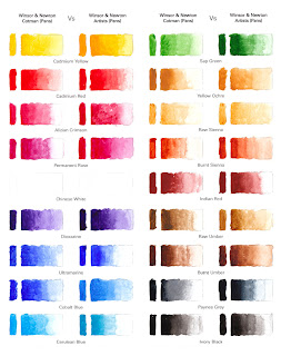
Winsor & Newton Cotman V’s Winsor & Newton Artists
Now I have tested the Artist Colours it’s time to put them side by side and see what the difference really is. I know that the colour isn’t just the only difference, the lightfast, the length of time the colours will last all come into it but for me the strength of the colours matter the most. There is a lot of difference in retail price and you nearly get double the amount of pans in the Cotman set, I wanted to see the difference. I knew I would eventually have to buy some artist colours for this project but as I don’t use watercolour much I have been very contempt in using the cheaper ones. If I start getting into watercolours which I doubt very much would it be worth me laying out the cash for a larger Artist set? PLEASE CLICK THE IMAGE TWICE FOR THE LARGEST SIZE.

Project 6: Watercolour

Lifting Out and Preserving the White of the Paper

A pure water colourist will use the white of the paper and not add Chinese white of Gouache to make white. Personally if I need to use white I don’t see any harm in doing so and don’t think that this method deserves to be frowned upon. However I must have a look and sample all the other methods that are available to retain the white. Sometimes it is impossible with some methods to fully get back the white of the paper due to the staining pigments within the watercolour paint. All of the methods need to be done quickly and whilst the paint is still damp and not totally bone dry. Some of the methods mentioned you really need to be very careful with as you could so easily damage the paper and not be able to repair it.


Project 6: Watercolour Resist Techniques

Resist Technique Sample Five

Paper: Economy Board Weight Unknown
Paint: Crawford & Black

I have unfortunately run out of hot pressed watercolour paper so instead of using watercolour paper I have used Economy Board which is similar to cartridge paper just a little bit thicker. As I was quite sure that this paper wouldn’t allow me to do a wet on wet due to it might cockle I had to use wet on dry for the salt technique on the background. I have used the White China pencil and an white Oil Pastel to do the drawing. The drawing was a quick study and I found it hard to see where I was putting it on the paper. I might do it again but on watercolour cold press paper as I prefer the wet on wet sample I did with the Rock Salt. I have also used a lifting out technique to get a paler colour on the figure, I shall look more into this technique next.

Project 6: Watercolour Resist Techniques

Watercolour Resist Techniques

I have previously tried the water resist technique with Oil Pastels when I was sampling with Oil Pastels. That time I used just the Oil Pastels with watercolour and Ink however this time I will be looking at more materials that can be used to resist the watercolour. I will be experimenting with Bees Wax, Oil Pastels, Candle Wax, crayons and also a China Pencils. All these have wax in the material and therefore should repel the watercolour as wax and water don’t mix. You can use this technique for creating textures in rocks, on water to create the sparkle or even in full paintings as in Henry Moore’s London Underground paintings where he got the idea from a child’s set of wax crayons. PLEASE CLICK THE IMAGE TWICE FOR THE LARGEST SIZE.

Resist Technique Sample One

Paper: Gerstaecker No 3 @ 200gsm
Paint: Crawford & Black Watercolour

All these samples can be used for different textures it really depends what you are looking for. I have tried different colours but I do prefer using just the white however I find it hard to see what you are drawing if you don’t have the light shining straight onto the paper. It might help it your paper isn’t totally pure white which different brands of paper seem to be different shades of white.

01. Block of Natural Beeswax
02. Berol Oil Pastels 

03. House Candle
04. Crayola Crayons 

05. China Markers (Chinagraph)


Saturday 25 February 2012

Project 6: Watercolour Textures Salt

Texture Samples Salt...

Paper: Gerstaecker No 3 @ 200gsm
Paint: Crawford and Black


Project 6: Watercolour Textures

Texture Samples...

Paper: Gerstaecker No 3 @ 200gsm
Paint: Crawford and Black

Below are some samples of texture that can be produced with watercolour paint, anything can be used to make a texture the problem is finding the right thing. Some of more common ones that artists use are flicking with a toothbrush, using cling film, bubble wrap, sponges and cardboard.


Project 6: Watercolour Dry Brush

Dry on Dry Technique:


Project 6: Watercolour Wet on Dry

Unlike Wet on Wet the Wet on Dry technique simply means adding wet paint to a dry surface. If you are adding one layer on top of another layer the first layer must be completely bone dry, this makes this technique very time consuming if you want the paint to dry naturally. You can speed things up by using a hair dryer however you must be careful when drying the paint in case you make the paint move. The wet on Dry Technique produces hard, sharp, crisp marks more suited for detail work. It is also easier to control then the Wet on Wet technique as the paints don’t spread and go everywhere, beginners tend to start with the Wet on Dry technique. Most of the samples of paintbrush strokes I did previously are Wet on Dry.


Wet on Dry Sample One...

Paper: Gerstaecker No 3 @ 200gsm
Paint: Reeves (Tubes)

The paint has been applied on dry paper with a paintbrush either by applying a stroke or by flicking the paintbrush. If paint has been applied on top of paint I have made sure that every layer of paint was dry before applying the next layer.


A lot of the samples not shown online were to do with laying washes on different supprt and brands of watercolour paint also sponges and foambrushes were used.


Wet on Wet Sample Seven...

Paper: Crawford & Black @ 230gsm
Paint: Reeves (Tubes)

I tried a very quick painting which took me around five minutes to complete. This has been done in one colour over layering the below layer to make it darker. All the strokes were wet on dry and all the layers were dried with a hairdryer completely before applying another layer of the same strength paint.

Project 6: Watercolour Wet on Wet

A lot of the samples not shown online were to do with laying down different types of washes and comparing different paints and supports.

Wet on Wet Sample Fifteen....

Paper: Crawford & Black @ 220gsm
Paint: Winsor & Newton Cotman (Pans)

On this sample I have used a Variegated Wash for the sky in the background using three colours. A Variegated Wash means a wash which uses two or more colours. The colours again haven’t turned out vivid, I either require Artists colours which I have already got on order or put less water into the mix and make it stronger. I could even try a dry wash as the colours will be stronger but from what I’ve read it’s harder to get a flat wash without any streaks, I supposed I will have to also look at this method. The flat wash that I have done has improved and come a long way since the first sample and I feel more confident in doing a wet on wet wash which I was unable to do to a decent finish before starting this project. I can’t wait for the Artist colours to arrive to compare them against the Cotman’s pans that I have just used.

Please Click Twice on the Image to see Full Size...

Project 6: Watercolour Wet on Wet

Wet on Wet Sample Six

Paper: Crawford & Black @ 220gsm
Paint: Winsor & Newton Cotman (Tubes)

As I have already done a reproduction of this in Oil Pastels which can be seen in under Oil Pastels  I thought it would be an excellent image to do using the wet on wet technique. As the ink ran on sample five I have drawn the image using a  Watersoluble Graphitone Pencil which should just wash away. Underneath you can see the painting which everything has gone wrong, I knew I shouldn’t have chosen watercolour. I decided that the colours where too weak so I added another layer of red paint this has made a very crisp edge. I am going to have to use stronger colours with less water in the mix. I might give it another go and try again and see if it improves. I really want the colour of the horse more intense and crisper then the background. I might try just wetting the paper once rather than wetting it twice as I’m sure that’s what’s diluting the colours.


Wet on Wet Sample Seven: A Rookie Mistake

Paper: Crawford & Black @ 220gsm
Paint: Winsor & Newton Cotman (Tubes)

I have just notice I have done a rookie mistake, for the last sample I’ve actual done the painting on the wrong side of the paper. Sometimes it’s hard to spot the difference in the sides if it hasn’t any watermarks or both the sides are similar in texture. However in this case the correct side is a lot rougher then the wrong side and can be spotted a mile off. I questioned if painting on the wrong side of the paper would look any different then if the painting was done on the the correct side. The texture would be different of course but I also wanted to know if it would modify the paint in any way so I would notice the difference if I were standing further away from the paper. On Wet on Wet Sample Seven which is below I have taken two pieces of watercolour paper one the right side and one the wrong side. I have painted them both at the same time with the same amount of paint and water, and I think the results speak for themselves.

Project 6: Watercolour Wet on Wet

Here are some sampling using the wet on wet technique, this simply means either applying wet paint on top of a surface which is already wet with either paint or water. This method can be hard to control The paint travels along where the water has been laid; where the paper is dry the paint will not travel. Wet on Wet requires thick watercolour paper, the thicker the better due to the amount of liquid involved with this. The technique is unpredictable as the paint has a mind of its own, wet on dry leaves crisp sharp edges this technique leaves the marks soft and blurred. The colours need to be strong due to the water already laid down will make the saturated paint go paler.

Wet on Wet Sample Four....

Paper: Crawford & Black @ 220gsm
Paint: Winsor & Newton Cotman (Tubes)

An experiment showing that the paint will follow where the water has been placed, the paint will not go where the paper is dry. Water was added to the paper with a paintbrush in the form of lines which cross over. Paint was then dropped on to the lines of water where the paint spread and followed the lines.


Wet on Wet Sample Five...

Paper: Crawford & Black @ 220gsm
Paint: Winsor & Newton Cotman (Tubes)

Had a look at creating a background using the wet on wet technique. I started off by taping the paper to board I used the paint brush to wet the paper and waited about a minute and added more clean water. Once I let the water settle I then added some paint, a couple of colours where used for each section and the water mixed them together. There is one section where it has created a Bloom which is what I don’t like about the medium, some people like that effect I don’t and I find it irritating.

Project 6: Watercolour

A lot of the sampling and experimenting for the watercolour I have failed to scan in the images as I was short of time, these will be added to the blog once the marking has been done.

To be added: Colour swatches, tints & shades, mark making with w/c and acrylic brushes, sponges, foam brushes, layering technique.

Project 6: Watercolour

The final medium I have chosen to sample and experiment with is Watercolour. This has to be the medium I find the hardest to use, rather than keeping in my comfort zone and use mediums I feel comfortable with I will plumage in to depths unknown. The project can go one of two ways, I might learn so many techniques by experimenting that I finally like the medium and produce something I’m proud of. Or it can go the opposite way where it totally goes atrocious and I get convinced never to touch watercolour again. At the moment I’m more likely to produce the latter however if I have these judgments in my head I might subconsciously make it go terrible.

A couple of serious points which steers me away from using the watercolour medium, it’s very hard to alter mistakes or change youre mind, with acrylics you just paint over it. Preparing the paper stretching the support is a pain; with arcylics you just get a support and start painting. I also find it hard to control paint it spreads where it wants to go specially using the wet on wet technique. Using the white of the paper for the white is also putting me off, spending all that time applying masking fluid then rubbing it off seems very silly. You dont use white paint, I could go on and on why I don’t like this medium, why I’m I doing this?


Watercolour Research:
I have tried to choose artists that use the watercolours with a very strong mix more paint then water to produce vivid colours. I have always associated watercolours with the wishy washy look and that isn’t for me. Every time I have used them it’s never gone right so I try and keep away from them. I did manger to find a couple of artists which seem to use them in the way I would like too. The first artist is Richard Marsh he seems to paint landscapes and seascapes but there seems to be an illuminating glow with his work. His daytime skies seem to be unrealistic vibrant skis with all the colours of a rainbow which I like. The second artists Whittam I would class his work more as illustration, his work reminds me of Lowry’s which I have always admired. His scenes are of a Northern background around the Stockport and Manchester area which Lowry also drew, however Martin Whittam curves his paintings to make them out of shape which reminds me of some cartoons and work by Michael Gutteridge.


Project 6: Acrylics Final Design

This is an image of the completed design, the frame hasn't arrived yet but its very similar to the one that I added in Photoshop. I will replace the image with the correct one as soon as the frame arrives. Please click the image twice for the full size.

Project 6: Acrylics Final Design

I noticed that they were something wrong with the main tower of the castle. After turning the canvas upside down it became clear that the tower had developed a lean. The tower which was behind this one was also a lot different in the width so I had to alter it. PLEASE DOUBLE CLICK ON THE IMAGES FOR A LARGER VIEW.


Once I was happier with it I had a look at the battlefront well that what I think it’s called the stones on top of the castle. In some places they looked too big and when I relooked at the photograph I had put too many in some places and not enough in others so I refine then areas.


Other areas need working on I have uploaded a page out of the project to some you just a few of the changes made.

Project 6: Acrylics Final Design

Once the all the boats and the other small changes were made I then looked back at the hills, I scanned the image into photoshop and change the colours before deciding to repaint them with Light Magneta. PLEASE DOUBLE CLICK THE IMAGES FOR A LARGER VIEW.


The hills felt better but the sky which I were happy with a few moments ago needed something I wasn't quite sure what it needed, I had an idea but if it went wrong I would have to start all over again.

Project 6: Acrylics Final Design

I made a couple of more changes I removed one of the boats even though I had changed it prevoiusly I still wasn't happy with it, it looks better without it theres more white space. Also the shadow from the bridge was removed, below are the before and after pictures showing the changes. The last image shows what the full design looks like at the moment...


Project 6: Acrylics Final Design

After returning back to the paiting after I put it away for a few months I looked at it with fresh eyes and didn't like what I saw. I had a look at the boats first and made half a dozen changes. These are the before and after pictures. PLEASE DOUBLE CLICK IMAGES FOR A LARGER VIEW