Final Design Part Three and Evaluation:
Evaluation:
Overall I’m reasonably pleased with the final design I have produced. I would say it’s not my particular style of painting but I wanted to try something different. Looking at The Fauves and especially Andre Derain I have learnt a lot about harmonising unrealistic vivid colours and about using the emotion that you feel for the colour rather than the realistic colours. In fact even now whist looking at the finish painting I’m still finding bits that I would like to change before varnishing the picture.
I’ve enjoyed using brushstrokes that I wouldn’t normally consider applying. Derain’s emulation of the sun rays is something I would associate with a child’s drawing and not one from a skilled artist. I can understand why The Fauves were ridiculed and not understood, todays saying a child could do better springs to mind. However until you have actually tried these principles you don’t comprehend how hard it is to emulate especially to make the whole painting work. It might look simple and to be honest I thought it would be easy to reproduce the style but the first painting I created I suddenly realised there’s more to this than meets the eye.
If I did the project again I would like to do it in a larger format I found it hard doing it on a smaller scale, the brushstrokes seem too thick for the size of the painting. Derain or any of The Fauves wouldn’t have put as much detail into the painting as I have done however I found it challenging leaving details out. With the castle they would have seen it as one shape and just blocked the item in, I have been too fussy and decided I would like a flag and the windows must be in the precise location.
I’m glad I took on the project I did and narrowed the research down into looking into The Fauves for the inspiration of the Explosion of Colour. At the end of the day it didn’t matter to me on the subject matter it was all about the colour. However I’m glad I took the opportunity to climb the walls of Conwy Castle in gail force winds, even though my legs start shaking at the mere thought of it. I believe I have fulfilled this unit to a high standard but due to time running out I haven’t taken sampling mediums and materials as far as I would like too. Hopefully I will be able to continue with this project within the next brief which is all about sampling materials.
Sunday 13 November 2011
Project 5: Explosion of Colour
Final Design Part Two:
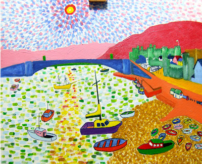
Now I’ve added a darker colour on the sea I feel it’s going in the right direction, it has also brought out the reflection of the sun in the sea. I’m not far off finishing, depends how fussy I get with all the details. The sand has had another coat of Yellow Ochre, I have tried dabbing the paintbrush rather than using small brushstrokes just to try and make it slightly different to the strokes in the sea.

Now I’ve added a darker colour on the sea I feel it’s going in the right direction, it has also brought out the reflection of the sun in the sea. I’m not far off finishing, depends how fussy I get with all the details. The sand has had another coat of Yellow Ochre, I have tried dabbing the paintbrush rather than using small brushstrokes just to try and make it slightly different to the strokes in the sea.

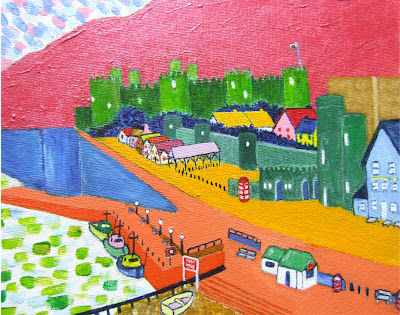
I’ve tried my best with the flag, its only half inch wide and it looks reasonable from a distance. I decided to add the flag so the viewer has a bit of a clue where the painting has been done. I find it hard to control the paintbrush with the texture on the canvas, it seems to go nowhere I want it. I suppose I could smooth that bit out by adding a mix of white paint and structure gel then smooth that part out to remove the texture, this will give it a smooth surface for the flag.

I’m beginning to think I should have done the drawing with a pencil rather than going straight at it with a paintbrush. After looking at the photograph there’s a few bits in this particular area that needs refining I won’t be happy with it until its put right.
I decided to keep the phone box the original red; it just didn’t feel right changing the colour of it. Its coming together now but there’s still a few details that are shouting at me that need refining. However I still think it’s come a long way since starting the picture this morning. I’m sure it will look ok from a very far distance, it’s not meant to be viewed at close range.
Hopefully this will be the last image I take until it’s finished; I need to get to a point where I can put the paintbrush down. I keep walking away for a bit than when I get back I see the painting differently and something else needs altering. I’ve also bought a tin of spray picture varnish by Pebeo, I have never used the stuff before but I will be trying out on this canvas panel.
Project 5: Explosion of Colour
Final Design Part One:
Due to the limitations of the colours I have in other mediums I have decided to do the final piece in Acrylic paint. I wanted to keep to just using pure colour without mixing which was the way The Fauves worked. I have chosen an image from the photographs I took whilst on location and I will be using this to produce the final piece. I I’m going to move the viewpoint slightly to get a better composition.

The sky was done in one of style of Andre Derain; he had two methods of producing a sky when he was going through his Fauve period. The first involves short board brush strokes going around the sun emulating the sun rays which is the style I selected for this painting. I have removed a couple of the boats in the foreground you can still see the ghost images of the boats. I wanted to see more of the sand area and the boats were just in the way so I removed them.
I’m not quite sure about the orange pavement it seems too vivid, I’ll see how I feel about it once I’ve added some more surrounding colours. The boats in the foreground still don’t feel correct; I’ll put a bit of gesso on top and redo them on tracing paper until I’m happy with the form I will then transfer them back over to the canvas panel.
Due to the limitations of the colours I have in other mediums I have decided to do the final piece in Acrylic paint. I wanted to keep to just using pure colour without mixing which was the way The Fauves worked. I have chosen an image from the photographs I took whilst on location and I will be using this to produce the final piece. I I’m going to move the viewpoint slightly to get a better composition.
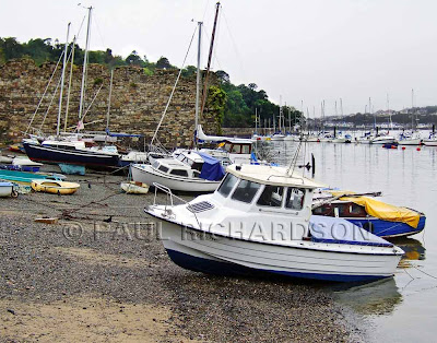
The photograph above is the image Iwill be using for the final piece, I will be changing the viewpoint slightly to give me a better composition.
Above is the preliminary sketch of the photograph which was done in pencil. Once I had the sketch I painting the image onto a canvas panel. I didn’t transfer it using a grid or Graphite transfer paper in fact I didn’t even draw it. I decided to thin some acrylic paint down with retarder and just paint it which isn’t the way I usually work but it was the way The Fauves worked with adding medium to their oil paints.
It didn’t go perfectly but I should be able to work with it. Maybe I should have thinned the paint out even more, it seems very dark for a under painting. I could also apply a very thin layer of white Gesso on top of the drawing to make the drawing fade a bit. I’m not quite sure where I’m going to start with the painting I think I will work on the sky and background first and work my way forward.

The sky was done in one of style of Andre Derain; he had two methods of producing a sky when he was going through his Fauve period. The first involves short board brush strokes going around the sun emulating the sun rays which is the style I selected for this painting. I have removed a couple of the boats in the foreground you can still see the ghost images of the boats. I wanted to see more of the sand area and the boats were just in the way so I removed them.
I was working from background to foreground that required the hills and the bridge to be done next. I wanted to do the hills quite thick to leave brushstrokes going in the direction of the sloping hills. The colours I have chosen for the hills have been matched as best as I could from a couple of Derain’s paintings which had mountains in the background.
I’m not quite sure about the orange pavement it seems too vivid, I’ll see how I feel about it once I’ve added some more surrounding colours. The boats in the foreground still don’t feel correct; I’ll put a bit of gesso on top and redo them on tracing paper until I’m happy with the form I will then transfer them back over to the canvas panel.

All the boats have now been redrawn, at the moment I’m feeling happier about them. The sand has been added but I’m a bit worried it will look too much like the sea. I might just do the sand in a couple of flat colours instead of using the broken brushstrokes method; I’ll know more once the sea has been added to the picture. The orange pavement has been made less vivid by adding Gesso to the mix, it feels better and harmonises with the other colours.
Project 5: Explosion of Colour
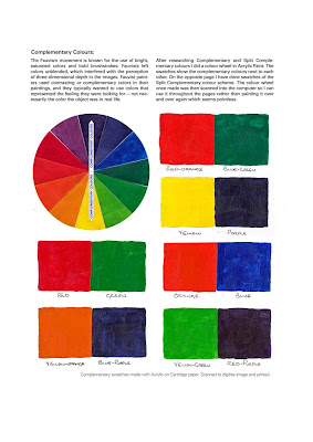
I started to research Colour Theory, The Fauves used Complementary colours here are a couple of pages taken from one of the folders.
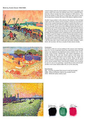
Andre Derain from The Fauves movement really inspires me so I looked into the colours that he used. I have matched them up as good as I could to the Acrylic paints that I had in. I don't have that made oil paints or else I would have used the. The Fauves used pure colours straight out of the tube without mixing them and I wanted to do he same.
Project 5: Explosion of Colour
Project 5: Explosion of Colour
 Please Click the images twice for the largest size...
Out of the photographs I took when I was at Conwy Castle the one below was the first one tha I really liked and wanted to have a look at.
This is a quick sketch of the above photographs; I have changed a few things and will probably change a few more once I start using medium. I have not tried to be as accurate as possibly I just want to get an overall feeling.
The sketch only took 5 minutes to do and it will do for what I want. There are houses in the background I decided to bring them forward so you actually see them.
Next I tried Carres Conte Crayons; don’t know why they called them crayons there just a harder version of the soft pastels.
I’ve tried using watercolour, I’ve used it very strong to try and get saturated colours rather than the wishy washy feeling you normally associate with watercolours. I have also removed the two rowing boats from the beach as I felt it wasn’t adding anything to the overall composition. I’m surprised how vivid the colours can get but the medium isn’t for me. I’ve also added a Welsh flag on to one of the boats so the viewers have an idea where it is.
This was created using Derwents Inktense Blocks with a bit of white Gouache thrown in for good measure.
Project 5: Explosion of Colour
The new project is simply called Research for Design and as the title suggests its more about the research side of things rather than practical. You first had to select a theme as a source of inspiration which I went with Explosion of Colour, I investigated loads of appropriate designers which included the below:
Peter Graham
Paul Signic
Helenka Wierzbicki
Char J Michelson
Franz Marc
Wassily Kandinsky
The Fauves:
André Derain
Georges Braque
Henri Matisse
Maurice De Vlaminck
Max Prechstein
Erich Heckel
Karl Schmidt-Rottluff
The project was then narrowed down to an in depth focus, a lot of The Fauves did a lot of paintings of boats, canals, harbours so I went in that direction. I live on the coast and decide to take photographs and sketches of Rhos on Sea, Llandudno, Rhyl (Blue Bridge area) and the quay near Conwy Castle & Deganwy area.
* For some reason I haven't bothered scanning in the sketches I did, these will be added at a later date once I have got the project back. All the sketches were done in between 5 and 10 minutes.
Subscribe to:
Posts (Atom)


