
Monday 24 February 2014
Unfinshed work...
All unfinished work that's been hanging around where do I start? or do I start something else instead?
Sunday 23 February 2014
Ceramics: Slab Pots
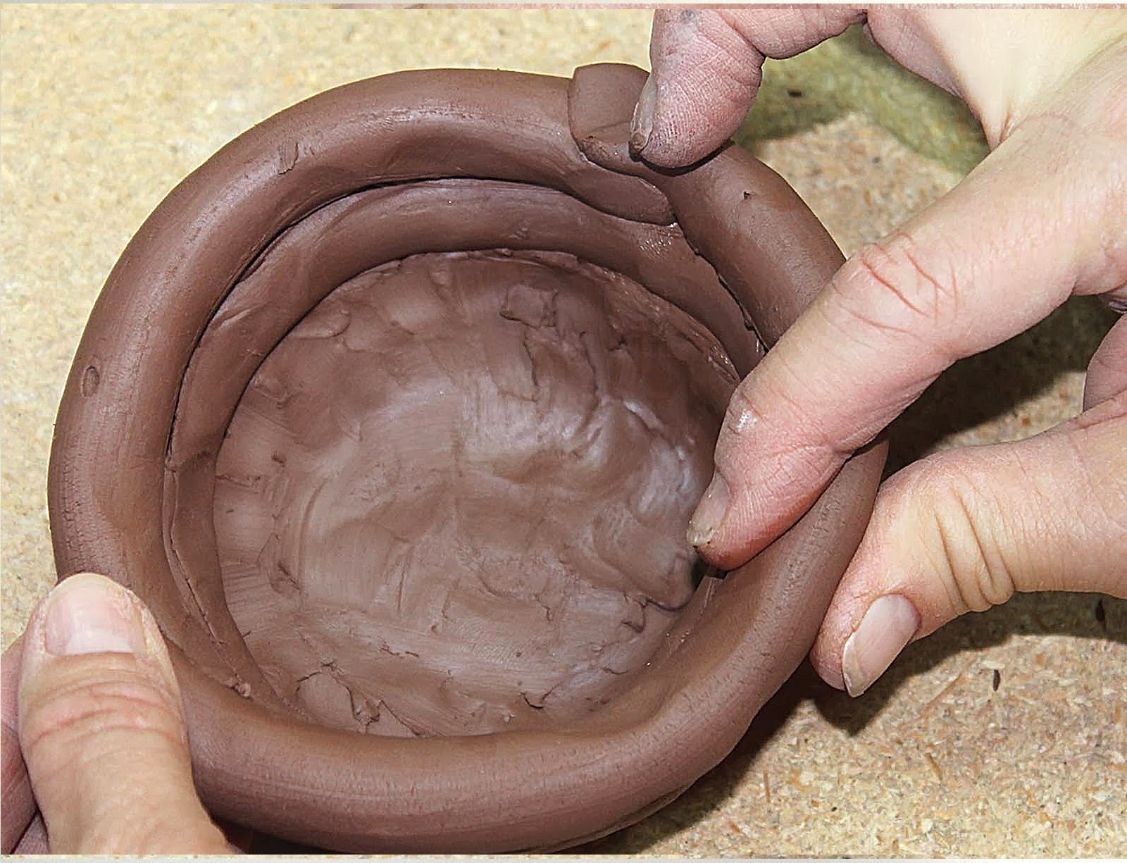
Six square clay pieces were cut, the harp sliced the clay into equal thickness then the tile cutter cut out the square shape. You do not have to stick with a square shape it’s just as easy to do a rectangle box instead. We just had to prove that we could do a box slab first and that it held together and after that we were free to do any shape if we desired to do so.
PLEASE DOUBLE CLICK IMAGES FOR THE LARGEST IMAGE

Everywhere that needed to be joined together were scored with cross hatches and paper slip was added to both parts that needed joining. Both joined pieces were squeezed together which caused the slip to ooze, the sides of the boxes required a 45 degree mitre which held the join better than if the two joins were placed flat side by side. The join was then worked on with the fingers or a tool until the join couldn’t be seen.


All of the joins required scoring in a cross hatch style before paper slip was added to produce a stronger bond.

Legs were attached to the base of the pot also two extra pieces were attached to the lid so the lid didn’t just slide off.


The side not seen is a blank side with no markings yet whether I continue to work on the slab pot remains to be seen.

The lid and design is supposed to be about trees and vein branches, it isn’t finished I need to build inside the pot still.
PLEASE DOUBLE CLICK IMAGES FOR THE LARGEST IMAGE
Everywhere that needed to be joined together were scored with cross hatches and paper slip was added to both parts that needed joining. Both joined pieces were squeezed together which caused the slip to ooze, the sides of the boxes required a 45 degree mitre which held the join better than if the two joins were placed flat side by side. The join was then worked on with the fingers or a tool until the join couldn’t be seen.
All of the joins required scoring in a cross hatch style before paper slip was added to produce a stronger bond.
Legs were attached to the base of the pot also two extra pieces were attached to the lid so the lid didn’t just slide off.
The side not seen is a blank side with no markings yet whether I continue to work on the slab pot remains to be seen.
The lid and design is supposed to be about trees and vein branches, it isn’t finished I need to build inside the pot still.
Ceramics: Colouring Pots (Glazing Technique)
PLEASE DOUBLE CLICK IMAGES FOR THE LARGEST IMAGE

Glazes on Ceramics: I choose an image I had drawn previously from my journal and photo copied it.

Glazes on Ceramics: I choose an image I had drawn previously from my journal and photo copied it.
The back of the paper was painted in a black glaze and left to dry (bone dry), it was then used like graphite paper to transfer the image to clay.
This is the completed piece before firing; the slab of clay was used with glazes the same way paint is used on a canvas.
After the slab was fired the colours didn’t come out as saturated as I expected the white also seemed transparent.
Ceramics: Coil Pots
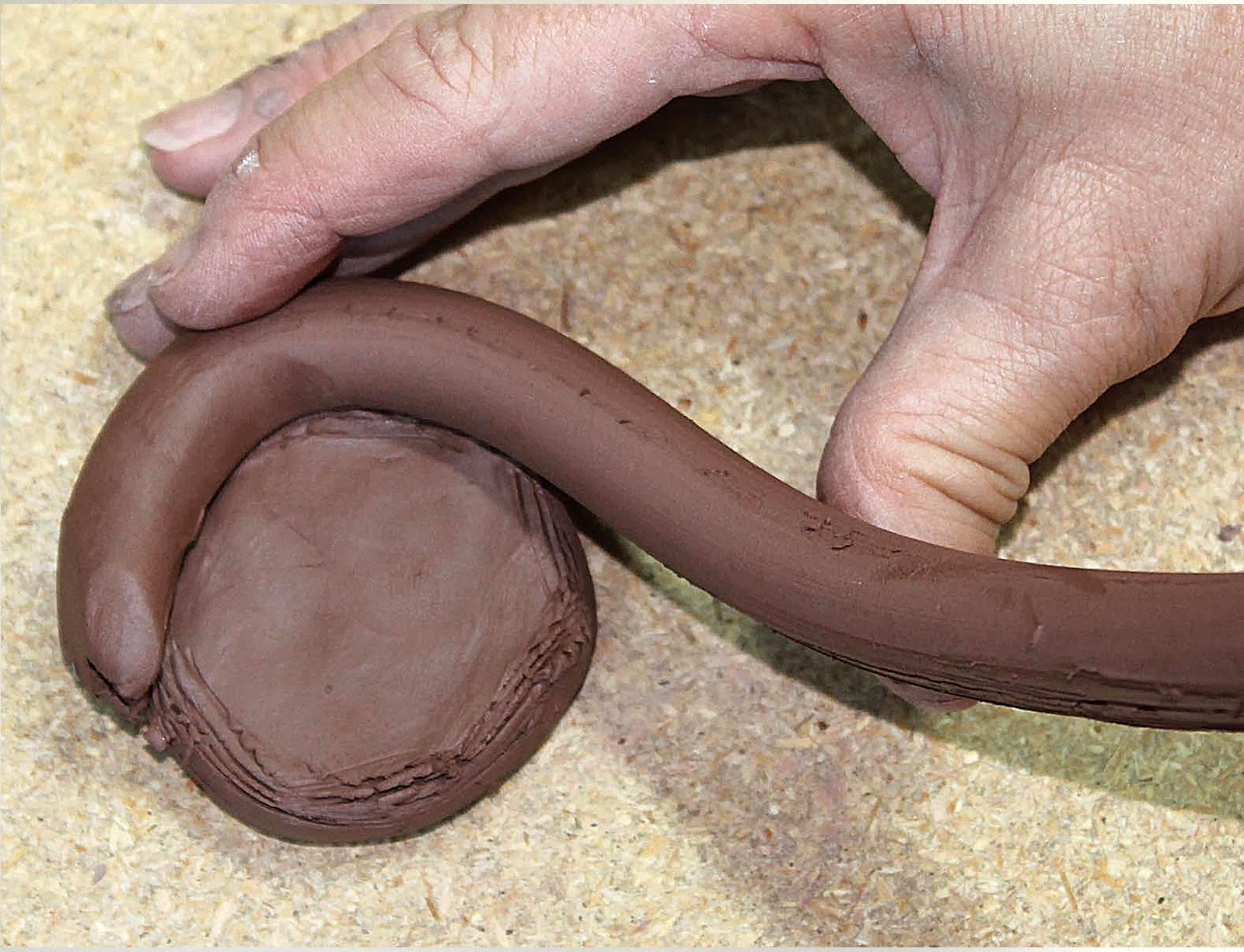
First of all I made a base for the pot there are a few different ways of making them. You can either roll the clay out flat on the press or just cut the slab with the harp to the correct thickness. The way I did it was to coil the clay into a spiral and just smoothed the clay out, the shape of the base can be cut with anything I think I used the open end of a pot noodle tub as a shape cutter.
PLEASE DOUBLE CLICK IMAGES FOR THE LARGEST IMAGE


The completed pot made using the Coiling method before it has been fired in the kiln.

The pot has been in the kiln and fired at 1000° but still remain porous, it requires a coating of glaze.
PLEASE DOUBLE CLICK IMAGES FOR THE LARGEST IMAGE
Once the base is built you need to add the coils again there are a couple of ways of doing this, you could use the Clay Extruder machine to make the coils. However I choose just to roll the clay out trying to keep it at a similar thickness. Slip is used in between the coils to hold the clay together, you can score the clay if desired with a fork to help it to bond together stronger. Slip is just the type of clay you are using added with water to make a thin paste which acts like glue. Once a few of the coils are on top of each other you need to smooth it down either using your finger or a tool like a kidney rib, once it is done the pot can be reshaped to the form you require by using cutters, ribs, fingers or anything you can get hold off.
The completed pot made using the Coiling method before it has been fired in the kiln.
The pot has been in the kiln and fired at 1000° but still remain porous, it requires a coating of glaze.
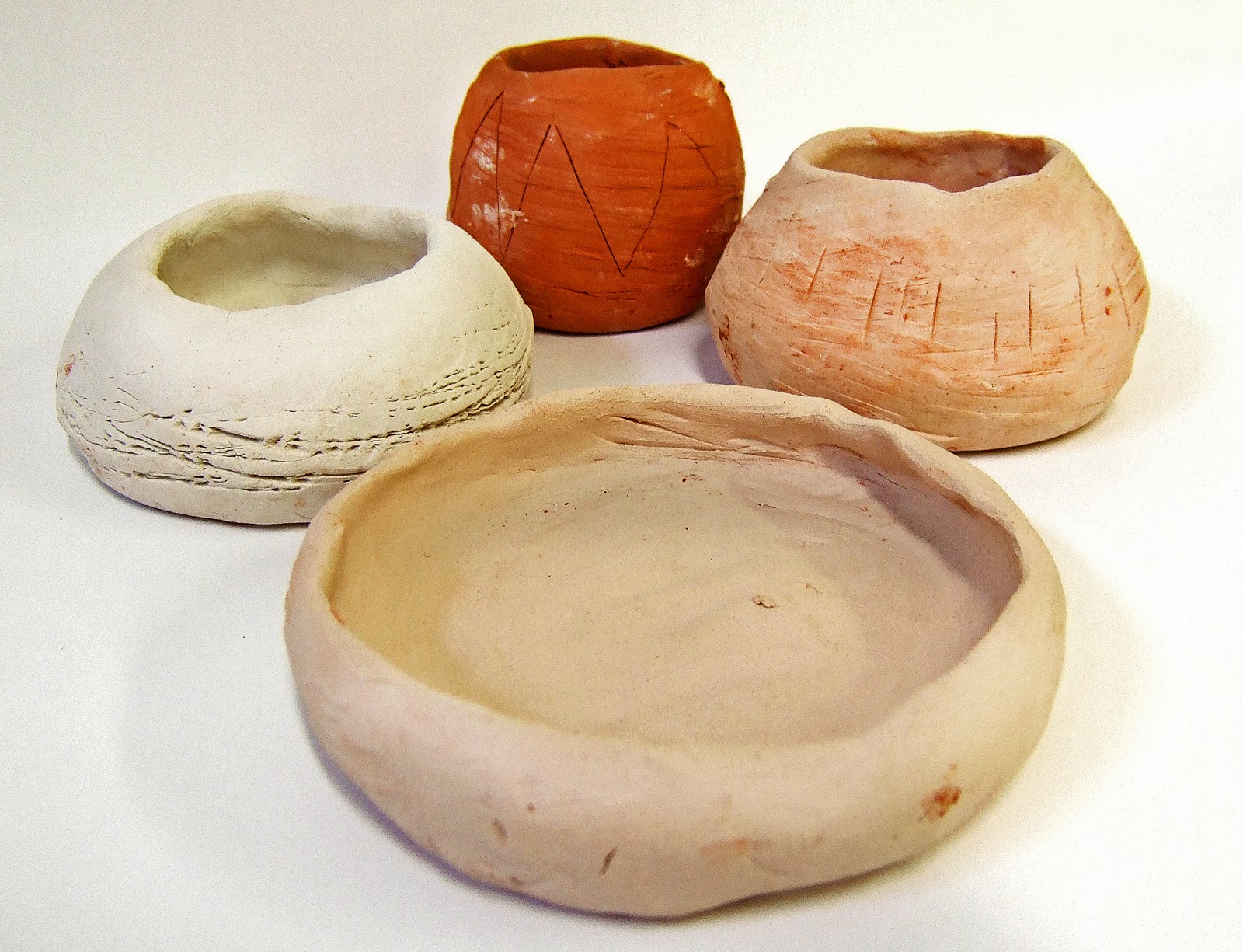
Ceramics: Pinch Pots
We were started off with the most easiest method of ceramics which is Pinch Pots, I haven't done anything like this since primary school and to be honest I don't really want to do it now. We were showed the different types of clay given a demonstration and had a quick talk about health and safety, unfortunately this lesson is sequenced for 10 weeks god knows why its so long.
PLEASE DOUBLE CLICK IMAGES FOR THE LARGEST IMAGE
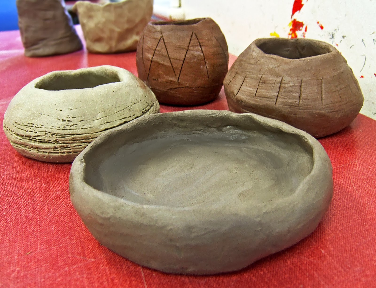
These are my sad attempt of the pinch pots, the top image was taken before the pots had been in the kiln and the bottom photograph is after they had been fired.
PLEASE DOUBLE CLICK IMAGES FOR THE LARGEST IMAGE
These are my sad attempt of the pinch pots, the top image was taken before the pots had been in the kiln and the bottom photograph is after they had been fired.
Print Making: Linoprint 02
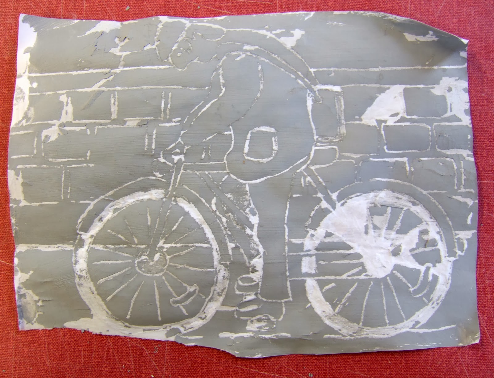
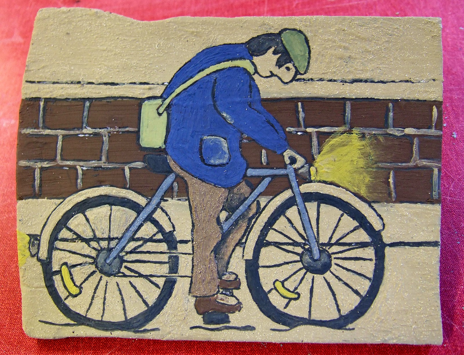
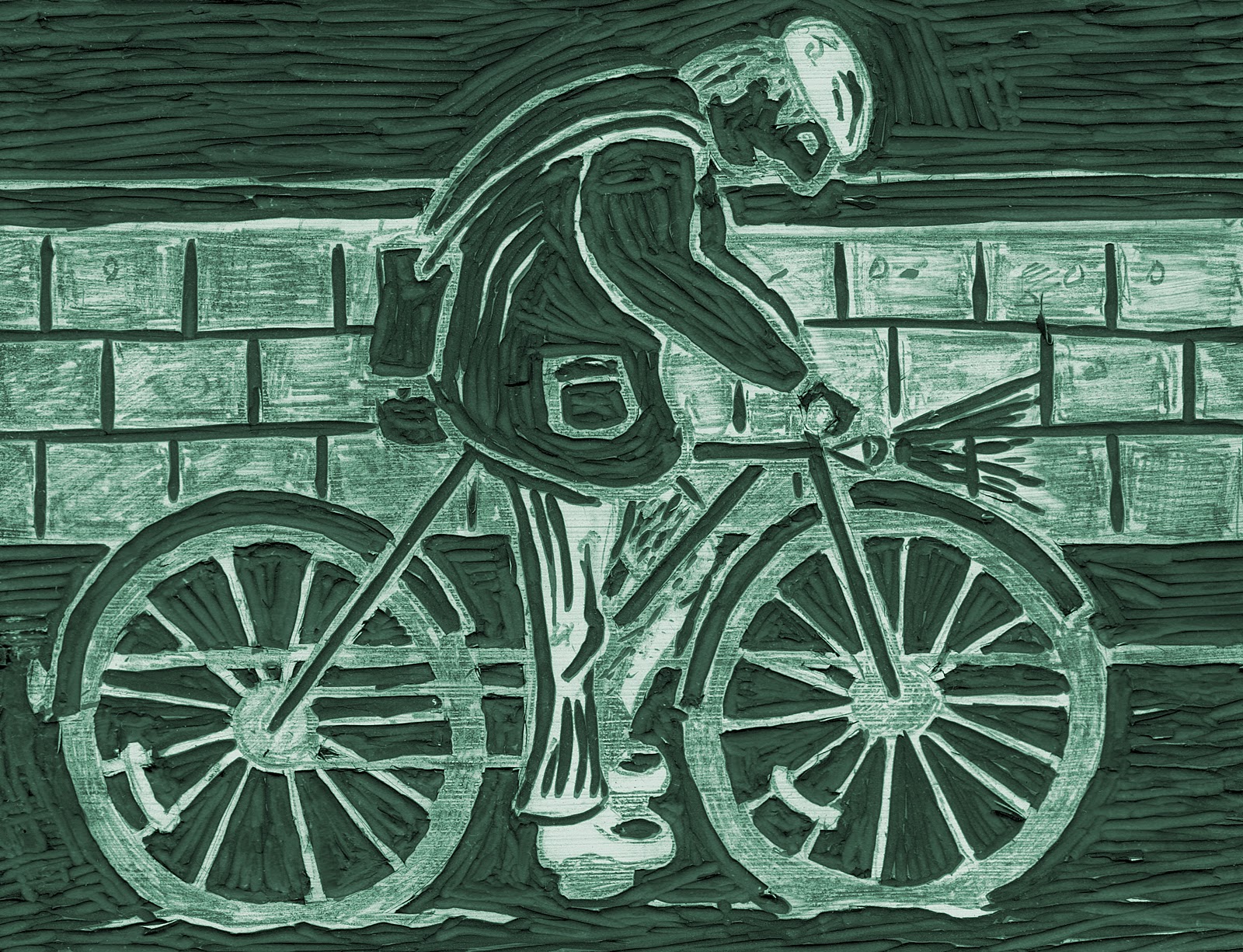
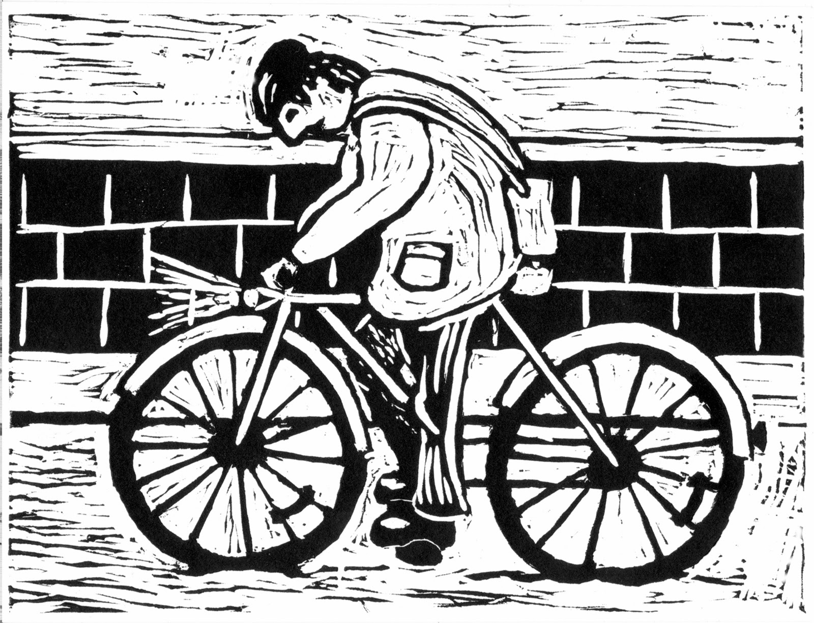
I wasn't happy with the last Linoprint I did so I started on another one, I used an image from a painting I started a few years ago to save a bit of time. I transferred the image to the plate by brushing Gesso on the Lino, I used Graphite paper to copy the image.
PLEASE DOUBLE CLICK IMAGES FOR THE LARGEST IMAGE

PLEASE DOUBLE CLICK IMAGES FOR THE LARGEST IMAGE
I have cut away the bits I wasn’t too keen about and I’m much happier with the plate now. The print was done at home with a baren for burnishing but hopefully I will get another chance to print it at college on the etching press which will produce a much better print.
Print Making: Linoprint 01
I have done a Lino print previously but it was a few years ago and it didn’t go completely to plan back then so I wasn’t too sure about doing another one. Out of all the print techniques I personally do prefer the look and style of the woodcut print above everything else, it has a certain appeal to me. I have always adored the work of German Expressionism which includes a lot of woodcuts. The other reason I like Linocuts is that you don’t have to rely on a printing press as it can be done at home with a baren, wooded spoon or even with a car with a sheet of wood to protect the paper. However the only thing I don’t like is that if I do too much of it my hands can be bad for a few days due to gout and arthritis. I looked at an old painting I did a years ago (Crown Inn, Stockport) and changed the angle slightly, I bought myself a new tablet for Christmas with a stylus pen so I decided to give it a try. I didn't have Photoshop Touch at the time and had to use a more simple program that was already on my Android tablet.
PLEASE DOUBLE CLICK IMAGES FOR THE LARGEST IMAGE
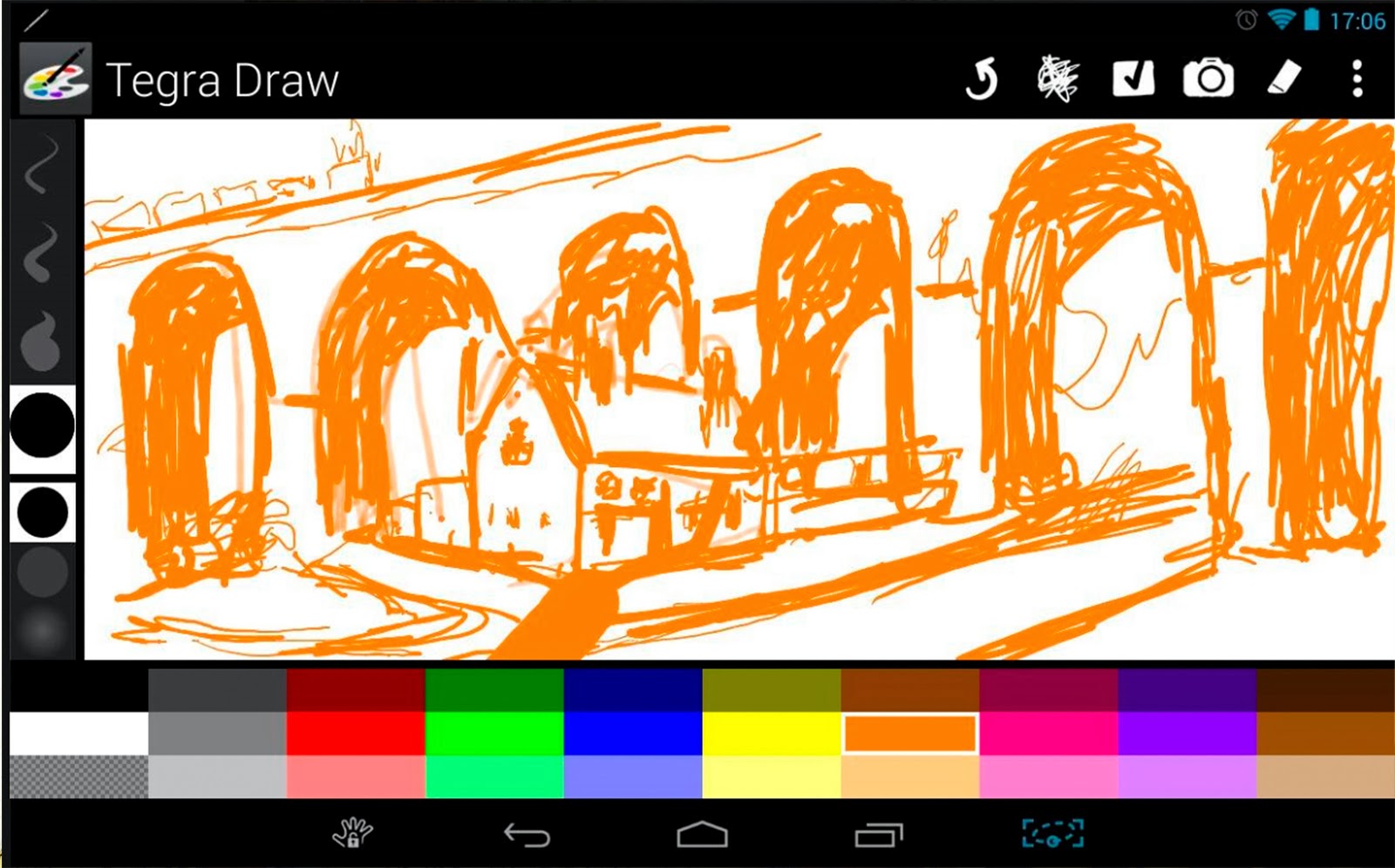
A couple of minutes quick digital scribble on a tablet using a stylus with Tegra Draw instead of Photoshop Touch.
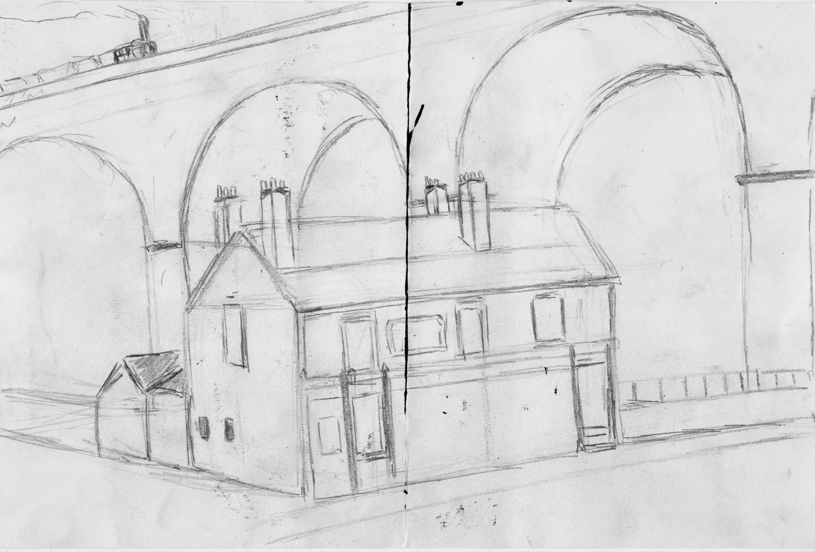
The original pencil sketch for the first Lino print, the image is of the Crown Inn in Stockport.
I didn’t have any larger lino then A5 and it wouldn’t arrive here in time if I ordered on the web, there’s nowhere around here that stocks them. I don’t know if this will work but I’m going to try and put both plates together, it might not work but I have nothing to lose as I won’t get the detail I want in such a small lino. After nearly cutting my fingers off I had reach a point that I needed to print it just to see what mistakes I was making. My hands and fingers were really sore by now and I had to stop cutting the Lino anyway. I made a bit of space found a piece of glass and rolled out the ink, as my room is rather warm the ink started to dry out before I finished. A wooded spoon was used and on the image below you can see the first print.


PLEASE DOUBLE CLICK IMAGES FOR THE LARGEST IMAGE
A couple of minutes quick digital scribble on a tablet using a stylus with Tegra Draw instead of Photoshop Touch.
The original pencil sketch for the first Lino print, the image is of the Crown Inn in Stockport.
I didn’t have any larger lino then A5 and it wouldn’t arrive here in time if I ordered on the web, there’s nowhere around here that stocks them. I don’t know if this will work but I’m going to try and put both plates together, it might not work but I have nothing to lose as I won’t get the detail I want in such a small lino. After nearly cutting my fingers off I had reach a point that I needed to print it just to see what mistakes I was making. My hands and fingers were really sore by now and I had to stop cutting the Lino anyway. I made a bit of space found a piece of glass and rolled out the ink, as my room is rather warm the ink started to dry out before I finished. A wooded spoon was used and on the image below you can see the first print.
Well what can I say a lot of time has been wasted with this Lino, I knew I shouldn’t have put both board together there’s a big line going all the way down and I don’t know if I can remove it for the next print. There are a lot of things I’m pleased with the viaduct has turned out well also the grass area with the fence. There are also a lot of things I got annoyed with I went wrong with the cut and started getting confused with the black and the light parts and reversed it half way through the plate. The main balls up which is a novice’s mistake is I didn’t reverse the image, I feel totally stupid about this error. Now can I change it, in fact is it really worth trying to fix it? I’m not sure, I need a brew…
Print Making: Dry Point Etching
As I didn’t want to start with a fresh drawing I used the last drawing I did on the painting brief. The image was first reversed on the photocopier as the print will be the reversed image. As I only have a small piece of Perspex I will crop the image to suit, as this is my first go at dry point I want to start small and work my way up to larger pieces if a wish to take the method further.
PLEASE DOUBLE CLICK IMAGES FOR THE LARGEST IMAGE


PLEASE DOUBLE CLICK IMAGES FOR THE LARGEST IMAGE
This is my first attempt of dry point etching on Perspex; it’s a very easy process. The Perspex is transparent so I copied one of my images, I engraved it into the Perspex with an etching tool, any other sharp object like a blade or needle would also do. Next the oil based printing ink was mixed with extender and spread on the plate with squeegee, the ink was then dabbed firmly into the grooves. Where no ink was required the ink was wiped gently from the plate with scrim or tarlatan cloth. Tissue paper, newspaper or pages from a telephone directory can be used to clean the plate leaving ink only in the incisions. Once the plate is clean including edges cartridge or w/c paper is soaked (20 mins) and blotted leaving the paper damp. The paper is then placed on top of the plate and printed in a press.
To add colour to the print make cut two cards the same size of the etching plate, these will be used for two separate colours. Once the cards are ready you need to ink the original plate and print on paper as normal however you need to trap the paper. This method is known as Offset printing you then transfer the print to the card reversing the image for each colour. The registration is set by either taping the paper down with masking tape or by using metal blocks. Once printed to the card the card is varnished this protects it. Carborundum is mixed with PVA to give the card some grip, the ratio of the PVA to Carborundum will differ depending how much tooth you want on the card for the ink to grab on. Leave to dry for about 30 mins once it’s dry ink up and wipe away any ink not required then print using the blocks for registration. I use two colours on separate plates and then the etching for contours.
These are the plates with Carborundum this gives the card some tooth for the printing ink to grab on.
Below is the final print, this is the first time I have tried this type of printing. I can see where I went wrong the ink is too vivid I either need to wipe off more ink on the plate or add more PVA to cover the Carborundum where the yellow ink is. Also the registration did go out slightly as I forgot to put the blocks down in place I moved it before realising. Though I do think it’s a lot of hard work just to print a bit of colour to the image; at least I gave it a go. I personally enjoyed dry point etching and printing with one colour only which I have done in the print below however instead of using the offset method to add colour I simply decided just to add a bit off watercolour to the image. Whether people actually do this method or not I don’t know I just wanted to know what it looked like and it seemed a lot easier to add a bit of colour this way. I honestly don’t think I will be taking up Print Making it just too mucky…
Top image is the first print using the offset method with Carborundum, the bottom image is print with watercolour colour.
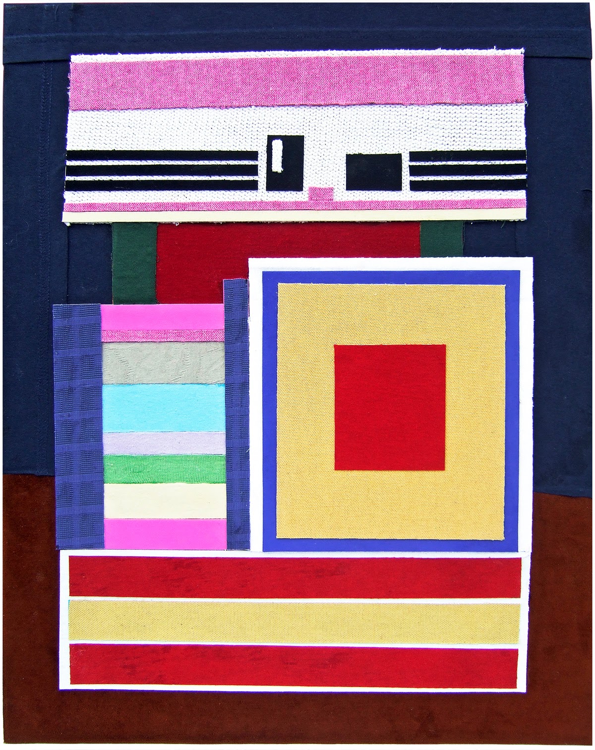
Textiles: Stuart Little Abstract
Textiles is not for me I really don’t want anything to do with it however I decided that I had to do something just to get it out of the way. I decided it would be easy just to make a college out of textiles; I took my latest painting which was an abstract version of Stewart Little in a Wellington which can be seen in the painting section. I started off by transferring the image to another canvas board; I have loads of them they only cost 90p each so I don’t mind wasting a few. I then took some appropriate material from college and cut up a load of clothes that no longer fitted the children, these were bagged up and ready to be given to charity but my art came first this time.
PLEASE DOUBLE CLICK IMAGES FOR THE LARGEST IMAGE


I applied some strong PVA glue and glued material to pieces of card once it was dry I cut out the required shapes. I found this way easier than just cutting the material as it left the edges jagged and frayed by not gluing it to card first. It was then a simple process of laying material on top of each other to produce the 3D effect I was after. These are a few macro photographs o show the material I used. On the next page there’s a photograph of the completed textile piece. Now this is out of the way I hope never to return I’ll stick with a pencil and paintbrush.
Finished textile piece of Stewart Little Abstract, the original is on canvas board and measures 50x40cm.
PLEASE DOUBLE CLICK IMAGES FOR THE LARGEST IMAGE
I applied some strong PVA glue and glued material to pieces of card once it was dry I cut out the required shapes. I found this way easier than just cutting the material as it left the edges jagged and frayed by not gluing it to card first. It was then a simple process of laying material on top of each other to produce the 3D effect I was after. These are a few macro photographs o show the material I used. On the next page there’s a photograph of the completed textile piece. Now this is out of the way I hope never to return I’ll stick with a pencil and paintbrush.
Finished textile piece of Stewart Little Abstract, the original is on canvas board and measures 50x40cm.
Textiles: Weave
We were shown how to do a wave in Textiles here is my poor attempt, this in the front and back. We used and old canvas frame and wrapped wool around it old pieces of textiles were then weaved into the wool. Textiles isn’t for me I just want to get it out of the way as quick as possible.
PLEASE DOUBLE CLICK IMAGES FOR THE LARGEST IMAGE


PLEASE DOUBLE CLICK IMAGES FOR THE LARGEST IMAGE
Painting: Stuart Little Abstract
After finishing the painting we were asked to paint our painting as an abstract piece for homework. I have never painted an abstract painting and I don’t particular understand them; I wouldn’t hang one up in the toilet. However I thought I better have a go so I grabbed a fresh canvas and went for it, it didn’t turn out well and I gessoed the canvas and an afternoon wasted. Eventually I went and did a bit of research to find out the different types of abstract paintings, I researched artist such as Hofmann, Rothko, Mondrian, Kandinsky, Pollock and other famous abstract artists. I also watched a couple of videos the one that stands out were Hans Hofmann Artist/Teacher which explains his push pull method. I decided to do a few very quick thumbnails to see if I could come up with anything. I found this really hard to do so I looked at my original painting and tried to simplify the shapes and colours.
PLEASE DOUBLE CLICK IMAGES FOR THE LARGEST IMAGE


I decided I wasn’t getting very far with the abstract version of the still life so I decided to have a play in Photoshop. I thought it would be easier to design it as you had the ability to change and swap things around easier.


PLEASE DOUBLE CLICK IMAGES FOR THE LARGEST IMAGE
Both of the images above where done very quickly as thumbnails on cartridge paper, these were done with soft pastels.
I decided I wasn’t getting very far with the abstract version of the still life so I decided to have a play in Photoshop. I thought it would be easier to design it as you had the ability to change and swap things around easier.
It seems to be moving in the right direction but whether I’m moving far enough away from the original I don’t know. Is this piece abstracted enough?
I’m happy with the final design all I have to do now is get this image onto a canvas and start painting. I might do a few small changes along the way but it won’t be too different from this.
This is a print of the finished painting the original painting has be produced on a Canvas Panel at a larger size of 50 x 40cm. Overall I’m happy with the piece I feel I have painted it in a convincing abstract style. I’m still not found of abstract art but I do know more about the style and would give them and extra minute whilst viewing them at a gallery rather than just passing by and moving on to the next realistic piece. If I had to do another abstract painting I would move away from the overlapping style and look more into Hofmann’s push pull theory and look closer at colour.I feel that my technic ability has let me down not all the lines are as straight as I would like them I didn’t have any decent tape to help me achieve this. However after saying this if you hold it at a distance of about 5 meters or more it doesn’t look half as bad as I thought it would. Abstract art is so far out of my comfort zone but I did try to understand it, I’m pleased with the outcome but wouldn’t frame it. If I gave the piece a title such as Stewart Little Plush in a Wellington boot with a Gleaming Rosette I believe the viewer would see it, however without a title it is unrecognisable.
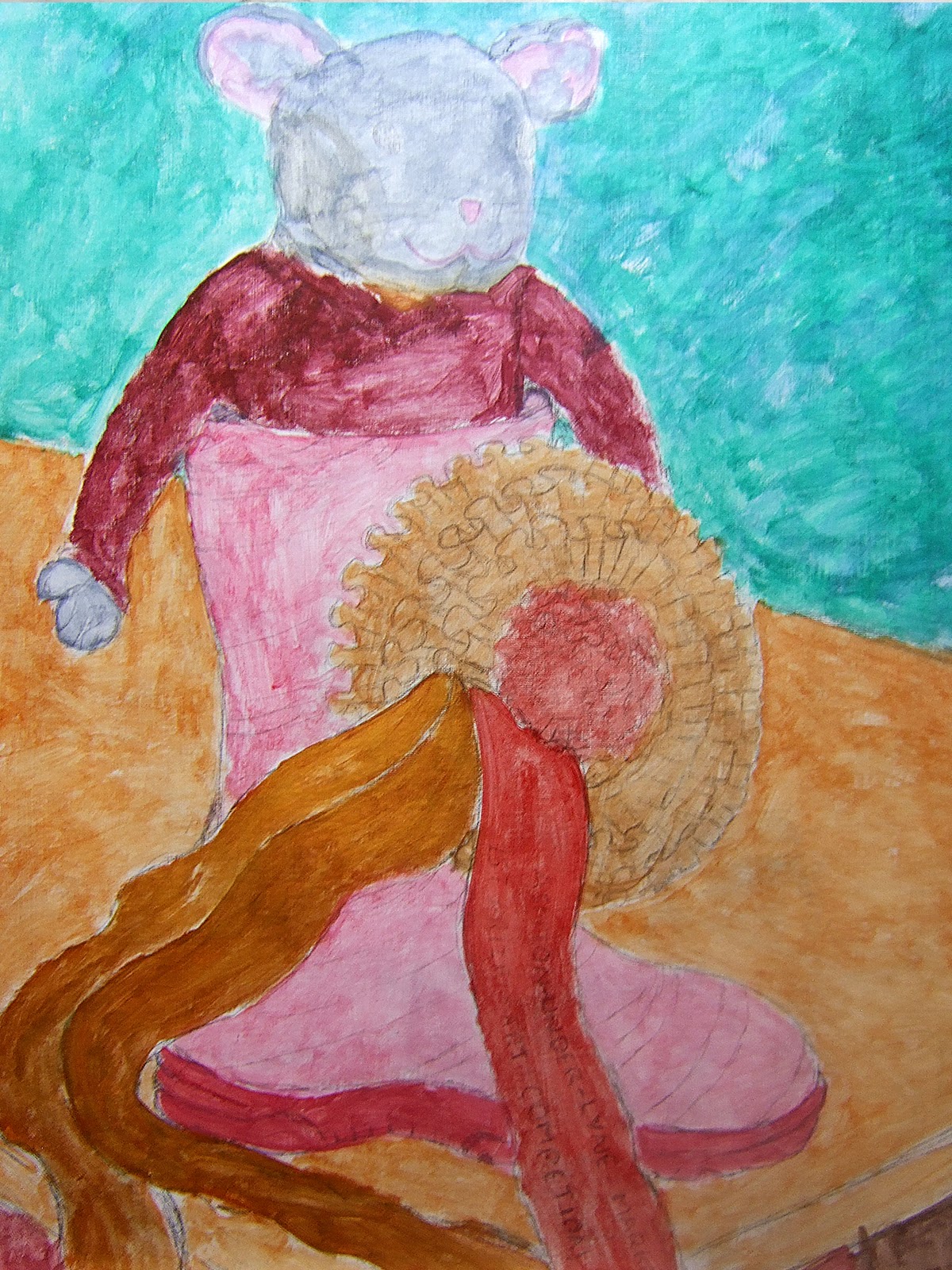
Painting: Stuart Little Still Life
I was told to bring something colourful in, the rosette I won in an art competition stood out for me. However it didn’t occur to me I had to draw it, mission abandon might be easier with paint.
PLEASE DOUBLE CLICK IMAGES FOR THE LARGEST IMAGE

This is the original drawing done on cartridge paper, I decided to stop here sleep on it and continue in the morning as I was having problems with the rosette.
.

I wasn’t happy with the plush starring straight at me as it was on the original drawing so I repositioned the head and redrew it on the original body.

Here you can see a photograph of the still life it has been took on a slightly different angle then the drawing.
I quickly painted the image to kill the white with thin acrylics as I wanted the drawing still to show through.

The next stage is a lot further down the line, I really found it hard to do the rosette I wanted more of an impression look. The table was painted different shades of brown and mahogany quickly painted in the same direction. It’s been quite a while since I’ve done any painting must be at least 6 weeks or so and I’m a bit out of practice, I also prefer working in oil paints as I find that acrylic paints dry to quick even with medium added to the paint. There’s a lot of things I’m still not happy with will have to work on it a lot more, a long way to go yet.

This is as far as I’m going with it due to time restrictions I would like to take another look at the table maybe do it lighter in places to suggest the sunlight in places.
PLEASE DOUBLE CLICK IMAGES FOR THE LARGEST IMAGE
This is the original drawing done on cartridge paper, I decided to stop here sleep on it and continue in the morning as I was having problems with the rosette.
.
I wasn’t happy with the plush starring straight at me as it was on the original drawing so I repositioned the head and redrew it on the original body.
Here you can see a photograph of the still life it has been took on a slightly different angle then the drawing.
I quickly painted the image to kill the white with thin acrylics as I wanted the drawing still to show through.
This is as far as I’m going with it due to time restrictions I would like to take another look at the table maybe do it lighter in places to suggest the sunlight in places.
Subscribe to:
Posts (Atom)