Wednesday, 30 March 2011

Project 3: Drawing & Painting Full Lenth Figure (W5)

This week I decided to use acrylic paints for a change, I wasn't that keen on the first one so I gave up and went to do a second one on the same page. I will have to try and practice, I just don't seem to have the time anymore I keep meaning too but fthings get in the way. The acrylics were used watered down more like watercolour paints.


Please Click the images twice for the largest size...

Saturday, 19 March 2011

Just to let you know...

I have now caught up with uploading stuff to the website/blog, everything from now will be up to date and in order. I have 4/5 weeks left on the Figure Drawing Project and then one more project to do after that the course will then be finished. I should image that I will also be doing another year which is Level 3 as its the last year that the course will be running at college.

Project 3: Drawing & Painting Full Lenth Figure (W4)

As I have been working with China Markers at home I decided to bring them into the Life Drawing class and see how the drawings turned out. The drawing on the left was a quick 10/15 minute drawing. After the 15 mins I moved slightly to a different place and took longer drawing the second drawing. I like the one on the left out of the two, the China Markers has to be sharp all the time as the led is about 3 mm in thickness which produces a thick mark. I also sat down with the easel this week and it wasn't as bad on the back as the week before. I have decided just to do the Thursday Life drawing class and not Fridays as well, the model has been booked up too Easter and the project is due in after the Easter break. I might try either ink or paint next week, will have to do some practice with the medium before the class though.

Please Click the images twice for the largest size...

Project 3: Full Lenth Figure (W3 @ Home)

More work I did at home using the Virtual Pose CD Rom, I have used China Makers to do the drawings. I have used two different brands Dixon Phano and Royal Sovereign these pencils are also known as Chinagraph or Grease Pencils; they are made from hardened coloured wax that can write on many surfaces. The first drawing are only 2/3 minutes quick poses, I was trying out the different colours, I particular like the red one. On the second drawing I had a look at using more than one colour in a drawing, these were 10 minuate drawings, same pose but from a different angle also model taken from Virtual Pose 3 DVD.

Please Click the images twice for the largest size...


Project 3: Full Lenth Figure (W3 @ Home)

The below is a piece I did at home not life drawing, the model was taken from the CD Rom Virtual Pose 3. It took rather longer than expected to complete, I'm going to have to practice with Charcoal. Apart from using it once in Week 1 of the Life Drawing I haven't used the medium by itself. The drawing I think went better then what I have produced up to now in the Life Drawing classes. I really struggle with hands and feet I find them really hard to do so I have not put any detail in them areas for now.

Please Click the images twice for the largest size...

Friday, 18 March 2011

Project 3: Drawing & Painting Full Lenth Figure (W3)

Life Class today was on the Thursday afternoon and not the Friday morning session which I preferred Thursdays, I know at the end of the session my back was killing me due to standing at the easel which I’m not use to. Thursday is a lot quieter than on Fridays Life Drawing session, there were only one other person apart from the four people out of our class and I knew him from a prior art classes. Today I felt a little bit more relaxed but the model only did 1 pose for the 2 hour session, I feel I can loosen up more as there isn't an art teacher in site looking over your shoulder making sure you measure everything. The drawing turned out ok, well better than last week but I’m still not happy about it the legs are on the small side compared to the rest of her. I want to add some colour I’m fed up with the black & white, I think I will start added colour next week and try different media.

Please Click the images twice for the largest size...

Project 3: Drawing & Painting Full Lenth Figure (W2)

This week is the my first Life Drawing lesson, 4 people out of our class have decided to do the Life Drawing project, so we have joined another class whilst we do our Life Drawing. There is also a possibility that we can also join the Life Drawing class on Thursday afternoon which I would prefer. I found the life drawing class really hard, it was the first time I used a stand up easel, the first time using charcoal and the first time in front of a model. Things didn't turn out as planned; even the measuring wasn't right however now the first one is out of the way let’s hope it gets better. Below are the two drawings that I did, I’m happier with the pencil drawing then the charcoal one.

Please Click the images twice for the largest size...


Project 3: Drawing & Painting Full Lenth Figure (W1)

This is one of the projects I have chosen to do from a list of about 14, we had two mandatory units which were Project One: Design and Project 2: Sampling. Project one had already been handed in to be marked which is why Project 2 comes before it on this blog. Project One has know been marked which I have received a Distinction; Project 2 has been handed in but not yet marked. Now the reason I have picked the full length figure drawing is because I have never had an opportunity to do any Life Drawing so as it was on offer I thought it would be daft if I didn't give it a go.

Research: We had to document the work of three designer makers, I made a long list of contemporary artist that did figure drawing and I looked into Bill Buchman, Fernando Botero and also Francine Van Hove. Bill Buchman is my favourite out of the three, Bill also has a dvd and books out which I purchased the book from Amazon and found it very motivating. Research also went into how to measure the proportions correctly and how to draw the human figure to a 7½ head figure.

Project 1: Design Units 3D Shape & Form

The project asked for: use 2d materials to construct 3D form, as well as the paintings and drawings below I also constructed half a dozen origami peices...

Please Click the images twice for the largest size...


Project 1: Design Units 2D Shape

This project was based around 2D Shape so I decided to recreate the below picture Meadow at Moritzburg by Max Hermann Pechstein as a flat colour image, I was looking on the lines of work by Roy Lichtenstein but without the Benday dots just the flat continuous colour without any shading.


Please Click the Pictures Twice to View the Largest Size…


Orignal painting "Meadow at Moritzburg" by Max Hermann Pechstein,

Below is my first attempt, I have reproduced the painting in Acrylics however I'm not satisfied with the overall appearance. I wanted to get flat colour without any streaks of different shades, with the Acrylics I found it impossible to achieve this result. I'm also unhappy as I had to lay the paint on so thick to try and hide the streaks the acrylic now shines giving the painting a glossy appearance, which is not what I was looking for.


The second attempt which is below was produced with Gouache on Hotpress Watercolour Paper which worked out a lot better than the first attempt. I still had some problems with the paint leaving a streaky effect, some colours went down fine without a problem where others where just as bad as the acrylics. The lighter coloured grass was a darker green at first but I had to paint over this also I had to change the colour of the path from an orange colour.

Saturday, 5 March 2011

Project 2 Sampling - Collagraph, Print, Mixed Media.

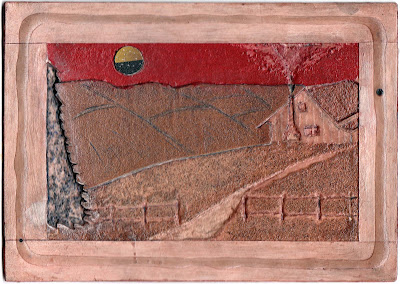
Collagraph is a technique that involves the relief printing process, I cut up a piece of Daler Mount Board than stuck loads of different materials to the board including sandpaper, create paper, sand, sugar, pva glue, salt, rice, cardboard. I also bought a cheap battery operated engraver for a couple of quid from The Works and engraved onto the plate. Once I was happy with the plate I sealed the plate with Sadolin Floor Varnish which was a bugger to find, this is an oil based varnish which dries in a couple of hours. I did try other varnishes in fact the whole class tried different ones but they were taking weeks to dry and once you put the plate through the printing press the varnish was coming out on the paper. Once the varnish was dry I tried oil based and also waterbased ink, the waterbased ink I preferred I bought these myself and they weren’t provide by college.

Once you have put the ink on the plate with Dollies then using leafs from the Yellow Pages excess paint were removed with a turning motion with the palm of the hand. Watercolour paper (300gsm) was soaked for a couple of minutes. The paper was then blotted with blotting paper & a rolling pin, this removed access water making the paper just damp. The paper was carefully placed on top of the plate; blankets were re-laid then the paper & plate were rolled through the
etching press with newsprint and newspaper to protect then blankets.

 The below samples are Ghost samples they are the second print from the plate as I didn’t remove enough ink, these are both done with waterbased inks. Oil based inks require an extender mixing in with the ink, they also take longer to dry and have a different feeling they also clean up a lot easier, the waterbased ink look more like watercolour paint once printing. If you don't have a printing press you can make one from an
old washing mangle or drive over the plate and paper with the front wheel of a car, make sure you place some wood above and below your plate and paper, you can also use foam or a camping/yoga matt as blankets.

Please click the image a couple of times for a lager image…

Below are two prints of the plate in 2 different waterbased inks, I prefer the black one out of the two, these are both Ghost prints as there were too much ink on the first print.


Over all I’m very satisfied with the Collagraph plate as well as the print. The hardest thing about the plate was putting the layers down, the fatter the item was meant the further back in the distance it will look when printed. This is the first time I have made a Collagraph plate and I’ve enjoyed it immensely. The texture on the print added to the final image the items weren’t just used for the sake of it, I enjoyed finding out in the foundation stages how certain materials would print, this really surprised me on some materials. The sampling was crucial as it led towards the decision of which materials were appropriate to use in this landscape. I was frustrated with some of the materials that I used on the sample plates; I expected more of an indent in the printed version. This was defiantly a huge learning curve but it was required to understand which materials were more appropriate to use to produce certain effects on the print.

A couple of things I would like to change on the plate, the moon seems slightly too big for the scene I would like to reduce the size, this could be altered quite easily. I would also like to try using two or more colours on the plate and experiment if water based ink and oil based ink work together in the same piece of work. I don’t mean mix them together but print with oil let it dry then print water based ink on top in certain places like the sky or moon. Don’t get me wrong I like the look of the water based inks and I’m glad I used these instead of sticking to the oil based inks which everybody else used. I wanted to experiment and try something different to produce a different look, by using different inks I have managed to do this. Over all I think the print of the final plate came out exceptional for my first Collagraph Print and hopefully I will be using this process again.

Project 2 Sampling - Wax Resist, Oil Pastels.

You have more likely than not already used the Wax Resist Technique in primary school, using a white crayon you make a drawing and apply paint on top which relieves the drawing you've made. Wax Resist materials is based on one fact that wax repels water, the paint either runs off where the wax has been placed or it collects in little drops. The main materials that can be used are anything that contains wax, a wax block, candle, crayons and oil pastels; I also came across Gel Pens and Bees Wax. Henry Moore also used crayons from Woolworths on his Underground War studies of people which have the same effect. The wax gives a random speckled effect which is quite eye-catching which could be used for many different effects such as rocks, cliffs and water.

After sampling with different materials, candle, oil pastel, Vaseline, Gel Pens, Bees Wax Bar, China Markers with different types of paper and brushes I decided Hot Press watercolour paper with watered down gouache was the best to use with the oil pastels. On this occasion I have chosen to apply Acrylic paint as well as Watercolours, also I've used wax crayon and oil pastels to create the resist. The resist also reminds me of dry brush techniques in certain parts. Other materials you apparently can use to do resist that I haven't already mentioned are Turpentine, liquid frisket, paraffin, Wax Resist Sticks, scoring on wax paper and even by using wax based pencils like Prismacolor.

Please click the image a couple of times for a lager image…


As I wasn't happy with the outcome of the above picture I decided to experiment some more and decided to try again. The Wax Resist worked a treat you can see the watermarks that have been left behind but the image was rushed, I was more bothered about giving it a go and seeing what happened. After some more experimenting I decided to use oil pastels with watered down gouache rather than watercolour and acrylic paints. Below are some of the stages towards the final image, these were taken with the camera and not scanned in; I took a lot longer reproducing the Van Gough's Starry Night.


Below is the final finished peice, the problem is I got carried away with the oil pastels and didn't leave enough white paper. I mentioned all the way through the project that I liked the dried water drops effect. I managed to produce that effect in the sky on the finished piece; you can see it better in the lighter part of the sky next to the hills. I decided not to use the technique on the Cypress tree or in the landscape; I felt it wouldn't add anything to this part of the picture.


To be honest after spending all the time on the picture I was in two minds if to put the wash on it. I was worried in cased I ruined it with the wash, this is only my second time with oil pastels I know it sad but I was happy with the outcome without adding the wash. Once I started using the oil pastels I was more concerned how the picture looked then thinking of the reason why I was creating this piece in the first place. I'm pleased with my version of Van Gogh's' Starry Night, its done good enough that you know what the picture is resembling. I found the landscape part easy to do and I really took pleasure in doing the Cypress tree, I think this shows it the image. However when it came to the sky and the stars I struggled, I found it hard to reproduce the look of the stars with the sky going around them. The oil pastels and crayons were just too thick it was hard to control and in the end I used the sgraffito technique to scrape the overspill from the pastels. To make it easier next time I would have to use thinner oil pastels or use a larger paper to work on to enable me to produce the correct lines in the sky.

Project 2 Sampling - Wax Resist, Oil Pastels, Candles, Gouache.

Using the Sgraffito Technique I created the below piece with oil pastels, I cut up a credit card and used that to scrape the oil pastels. Out of the materials I have used experimenting with Sgraffito I think I prefer Oil Pastels as they are a lot less mucky then using ink and the Acrylic paint. I also liked that I could leave it and come back to it later where with the other materials you had a time limited as it would dry out and become unscratchable.

Please click the image a couple of times for a lager image…


Project 2 Sampling - Sgraffto Water Based Printers Ink, Cityscape.

The below has Acrylic Paint on the bottom layer but I have tried a water based ink for the top layer. A cut up credit card was use for the Sgraffito technique. I found the Ink took quite a while to dry, there's a possibility I've used too much of the ink I should have spread the ink a little more making it a thinner layer. The last time I used the ink I used it sparingly and it dried a hell of a lot quicker than it did this time. I found scraping the ink away was very messy to do and the stuff got everywhere. However as it dried slower I was able to play with it longer than I would if it was done with the Acrylic paint. I like the way it hasn't removed all the ink the lines aren't as sharp as the samples I've done previously. I might try and do another one very similar to this but instead of randomly putting the first layer on I will lay the colour on in vertical lines so the colour of the buildings will be the same in the reflections rather than random colour reflections as in this sample. I think what I've produced has a nice effect it just needs a bit of thinking about, building reflections, colours, composure instead of just getting on with it. I would like to attempt this type of thing in oil but it takes so long to dry it won't be feasible this time.

Please click the image a couple of times for a lager image…


As the sample is still wet I wanted to try and remove some of the ink to make it dry quicker so I could place it in this folder. I burnished the Sgraffito sample onto some cartridge paper, I know this has nothing to do with Sgraffito but I really liked the marks it left behind so I've decided to include it. After doing this process about 15 times or so the excess ink has nearly all been removed. I even tried a Fixative that is made for oil pastels, it works wonders with oil pastels but unfortunately it doesn't really work with the water based ink. Thinking about it may be using a clear varnish might work; I don't have any in so I can't experiment with this idea.
 

If I'm honest I think I prefer the print version then the original sample; this also gives me a opportunity to view a mono version as well as the original random coloured version.

Project 2 Sampling - Sgraffto Oil Pastels, Fish.

Using the Sgraffito Technique I created the below piece with acrylic paint, I cut up a credit card and used that to scrape the paint. First of all I knew the image I was going to have; I then added the colour and waited for it to dry then added black Acrylic paint over the image. Whilst the black paint was still wet I scraped back into to paint and removed the paint where I wanted to see the colour below. The problem I had were the paint drying out extremely quickly even after added retarder to the paint mix. Hopefully when I get the chance I will redo the design but on a larger scale, also remove the marks left by the brush on the black parts by using a blending brush.

Please click the image a couple of times for a lager image…

Project 2 Sampling - Sgraffto Oil Pastels, Apples.

Using the Sgraffito Technique I created the below piece with oil pastels, I cut up a credit card and used that to scrape the oil pastels. Out of the materials I have used experimenting with Sgraffito I think I prefer Oil Pastels as they are a lot less mucky then using ink and the Acrylic paint. I also liked that I could leave it and come back to it later where with the other materials you had a time limited as it would dry out and become unscratchable.

Please click the image a couple of times for a lager image…